Consistency in Branding for Perfume and Cologne Packaging
Fragrance Packaging


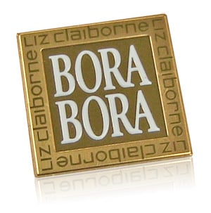
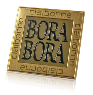
Common tooling is used in this example to create similar yet distinct metal labels for Bora Bora colognes and perfumes. The example illustrates the use of color to differentiate products. Using a single tool for embossing and stamping helps to control costs.
The design features a two-tone gold on gold background. Transparent gold is printed on the outside border while opaque gold is printed in the background of the debossed center area. The opaque gold is also used to print the Claiborne graphics in the border.
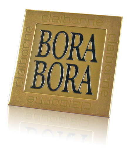
The embossed details on these nameplates do double duty differentiating graphics and creating a multi-level background. The outside border and Bora Bora graphics are embossed (raised) to the same height. A very fine outline around the part remains at original height creating a finished edge. Embossing the wide border gives the part the illusion of being a thicker metal nameplate.

The design is scaled up in this label for use on larger sprays in the fragrance line. Consistency is achieved by printing the same colors and embossing the same details.
Request a Nameplate Materials and Processes Guide to begin exploring the options available to you. Custom color matches, texture and assembly are only some of the options in creating your unique design.
Subscribe to Nameplate Blog
- 2021 (1)
- 3D (4)
- Adhesives (11)
- Aluminum (129)
- Aluminum In-mold (9)
- Aluminum Trim (41)
- Anodize (4)
- Appliance (12)
- Appliqué (5)
- Archive (35)
- Artwork Submission (4)
- Assembly (6)
- Automotive (35)
- Backlit (5)
- Boats (6)
- Brass (8)
- Brushed Aluminum (19)
- Carbon Fiber (2)
- Classic (1)
- Coined (5)
- Color Development (25)
- Computers (13)
- Cosmetics (24)
- Custom Patterns (11)
- Customization (16)
- Customized Patterns on Aluminum (2)
- Debossing (13)
- Diamond Cut (22)
- Digital Printing (2)
- ebook (4)
- Electronics (23)
- Embossing (53)
- Etched (20)
- Exterior (9)
- FAQ (29)
- Faux Finish (1)
- Faux Finishes (7)
- Favorite Nameplate (20)
- Furniture (9)
- Gauges (5)
- Gloss (4)
- Hang Tag (1)
- IDSA (1)
- In-mold Decoration (5)
- Individual Letters (7)
- Inlay (1)
- Key Fob (1)
- Labels (10)
- Large Vehicle (4)
- Laser Etch (2)
- Lithography (3)
- Match Box Cover (6)
- Materials and Processes (118)
- Mechanical Finishes (51)
- Medical Equipment (10)
- Metallic (8)
- Motorcycle (11)
- Nameplate (175)
- Nameplate Examples (54)
- Nameplate Tools (7)
- Outdoor Equipment (4)
- Overlay (7)
- Packaging (15)
- Patina Finish (3)
- Plastic (1)
- Plastic Trim (3)
- Point of Purchase (8)
- Polycarbonate (10)
- Process Color (16)
- Promotional Products (38)
- Prototypes (2)
- Recreational Vehicles (6)
- Resources (11)
- Safety Labels (2)
- Selective Patterns (10)
- Sill Plate (6)
- Sports Equipment (9)
- Stainless Steel (17)
- stock dies (10)
- Surfaces (4)
- Sustainability (1)
- Technical (1)
- Telecommunications (9)
- Testing (3)
- Texture (15)
- Top 10 (9)
- Woodgrain (2)


