Color Matching on Aluminum
Color is typically added to aluminum nameplates, labels and badges using lithography, screen printing and coating. This article covers basic guidelines in specifying and submitting colors to be matched for your nameplate project.
Our process engineers will determine which process is best suited to your nameplate application. Certain types of colors are better suited to specific processes. Your graphics or part requirements might also dictate the best process. Considerations taken into account when determining the appropriate manufacturing process are:
•lithography - needed for fine detail and halftones
•screen printing - needed for metallics and textures
•coating - provides overall color (opaque or transparent)
Specifying Color
Custom color matches can be specified using one of the following:
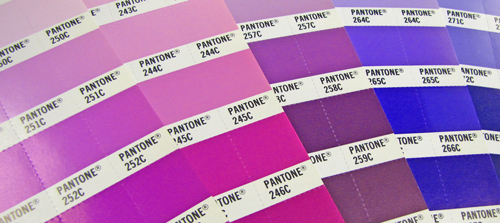
•PMS color - specify coated or uncoated color
•other color system - submit color chip
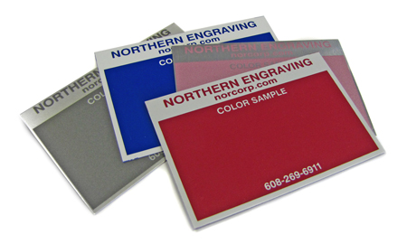
•custom color master - submit target master
Color Specification Checklist
 |
color application |
| graphics | |
| background | |
| |
background color |
|
over brushed or bright aluminum |
|
| over white | |
| other color | |
| |
gloss level |
| high | |
| low | |
| custom | |
| |
type of color |
| opaque | |
| transparent | |
| metallic | |
| |
light source |
| daylight | |
| cool white | |
| other |
Color Application
Matching a color sometimes requires multiple impressions of the color or an underprint of white. Understanding how a color is used helps to minimize critical registration.
Background Color
The substrate or base color a color is printed over may impact the color. Colors are matched over the color or substrate they will be printed on in manufacturing.
Gloss Level
The gloss of a color or pattern will have an effect on the perceived color of an object. The same ink or coating coated with different gloss levels of coating will look different. The lower the gloss the lighter the color will look. This is most evident on dark colors.
Type of Color
Not all colors can be matched exactly on all substrates. Bright colors and pastels do not always translate well to transparent colors. This is especially true for colors that have a lot of white in them. Metallics are screen printed with a coarse mesh and may not be a good fit for fine graphics.
Light Source
Consider where your product will be used. Color matches should be viewed under the same light source. A color may match under one light source and not under another.
Common Color Terminology
- Hue- the quality of color which describes the color, red, green, blue, etc.
- Value- the quality that describes the lightness or darkness compared to a gray scale
- Chroma- the quality that describes the saturation or percentage of a color
- Chromatic - perceived as having a hue; not white, gray or black
- Flip/Flop- pertaining to the appearance of a material when viewed from a direction far from the viewing angle, evident when a sample is turned in the light and it may look light when held one way and dark when turned
- Saturation- the attribute of color perception that expresses the degree of departure from the gray of the same value
- Metamerism- a condition when colors match under one light source but do not match under another light source
- Opaque- ink that does not allow light to pass through it and it has a good hiding power
- Transparent- inks which lack hiding power and permit transmission of light thus allowing previous printing or substrates to show through
- Tint- a transparent layer of color (see "Transparent")
- Metallic- inks which contain various sizes of flakes which have reflective properties and change the optical characteristics of the color
- Pearlescent- colorant containing various pigments and exhibiting various colors depending on the angles of illumination and viewing
- Shade- adding black to a color
- PMS- Pantone Matching System; a standard for color reproduction allowing a color to be specified by a name and number. It assures the right color when a job is printed
- Munsell- identifies color in terms of three attributes: hue, value and chroma. Recognized as a standard color specification in the U.S., Japan, Germany & Britain
- Light Sources- a standardized source of light for performing visual color evaluations and assessing levels of metamerism
•Daylight (simulates natural light)
•Horizon (simulates early morning or late evening sky)
•UV (ultraviolet light)
•"Illuminant" A (incandescent light)
•Cool White Fluorescent (commercial lighting)
•U30 (energy efficient fluorescent standard used commercially in U.S.)
•TL84 (energy efficient fluorescent standard used commercially in Europe) - CMYK- an abbreviation for cyan, magenta, yellow and black; a standard for offset printing in full color; also referred to as "four-color" process
- RGB- stands for "Red Green Blue", refers to the three hues of light that can mix together to form any color
- LAB- a color model used to describe all colors visible to the human eye; a uniform lightness scale
- Colorimeter - an instrument designed for the direct measurement of color
- Spectrophotometer - an instrument that measures light at many points on the visual spectrum which results in a curve
- Densitometer - a sensitive, photoelectric instrument that measures the density of images or colors
Ready for more discussion on your nameplate project? Let's talk!