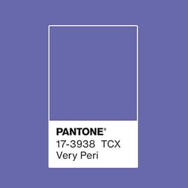
 Each year, the color experts at the Pantone Color Institute select a color of the year. For 2022, the choice color is Very Peri, Pantone 17-3938 TCX. Described as courageous, its presence encourages personal inventiveness and creativity.
Very Peri is a dynamic periwinkle blue hue with a vivifying violet red undertone. Blending the faithfulness and constancy of blue with the energy and excitement of red, this happiest and warmest of all the blue hues introduces an empowering mix of newness.
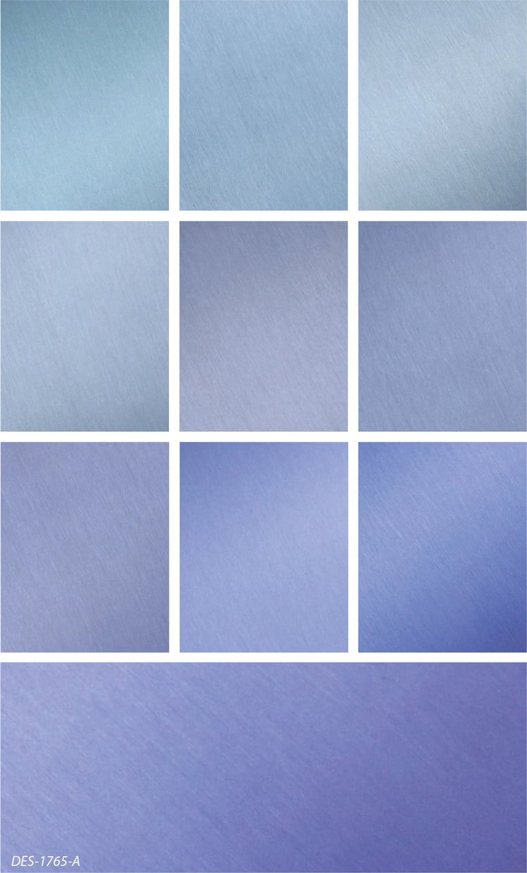
We wanted to showcase Very Peri by using it as a tint over brushed aluminum.
Translating an opaque color into a transparent tint of color is an effective option for taking advantage of the reflectivity of the metal substrate. However, doing this can be a slightly subjective process. Since we are adding clear into our saturated ink color to make it transparent, so we aim to get the color and overall character of Very Peri as close as we can.
Here's the progression of our color development for Very Peri.
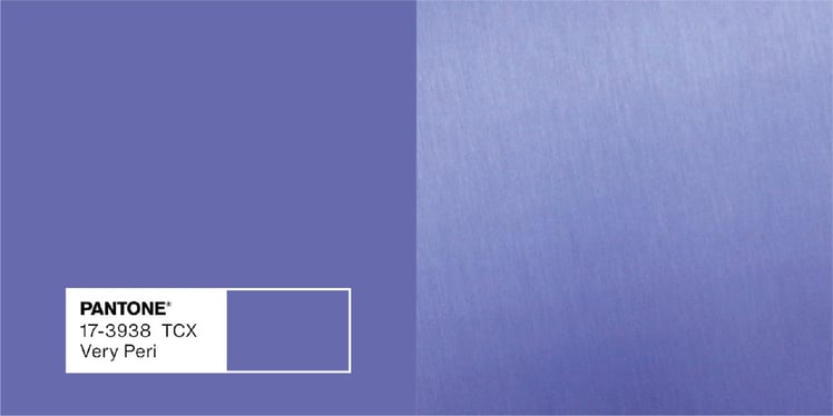
Our final interpretation captures the qualities of Very Peri's blue hue with a violet-red undertone. Here's to 2022!
How would you incorporate Very Peri into your next design?
Related Posts for Color Development
How to Define Color for Nameplates and Labels
Translating PMS Colors to Transparent Tints for Nameplates
Color Specifying for Product Identification
Have an idea of where you can incorporate color with your next design? Let's talk!

