Aluminum Point of Purchase Signage
Point of purchase signage needs to grab and hold the attention of shoppers. It can be tempting to throw everything you have into the design with the thought that more is better. However, this can lead to over-stimulation and confusion for the prospective buyer. What do you do to curb this? Sometimes it's the small details that matter and the best answer is to keep the design simple.
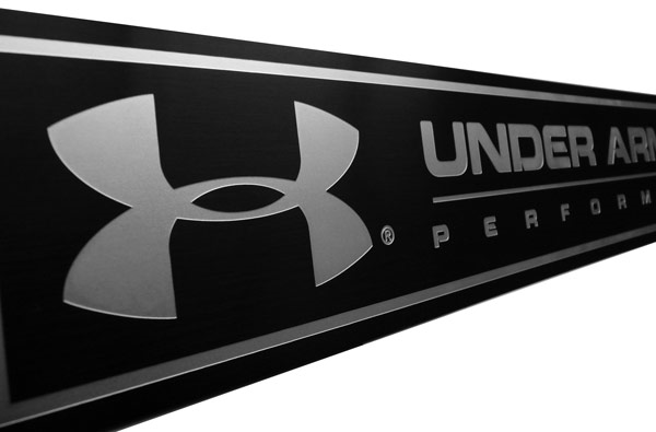
Simple Contrasting Colors on Aluminum
One of the most common contrasting color combinations for aluminum nameplates and overlays uses the natural silver color of the aluminum and basic black as seen in the image above. This is a natural and comfortable combination which means that it is easily digested and understood in the marketplace. Keeping the design simple also has cost benefit in that decorating processes are at a minimum which helps to keep your piece price low. Contrasting colors provide interest to grab that attention and differentiate your product from the next one down the line.
How can you incorporate contrasting colors for your next aluminum nameplate? Let's find out!