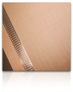
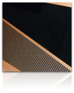
Luxurious Copper
The Juxtaposed Mood Board explores contrasting finishes on aluminum with varying gloss levels, selective textures and color opacity - all using basic silver and black colors resulting in clean and elegant looks. These same structures have been refined using warm copper tones - adding a sense of luxury to the mix. Here is a snapshot of a couple of them:
I love this copper transparent tint on brushed aluminum and how the selective low gloss creates a soft satin feel. The high gloss texture detail on the high gloss bead has an inlaid look. This shows basic decoration and yet speaks of rich, refined tastes.
The same copper tint on brushed aluminum is further enhanced with high gloss piano black and coordinating metallic copper in the finish below. The result is a sophisticated look that draws you in. The contrasting lines add interest with a bit of dimension achieved through texture.
What colors would you use to further transform these structures? Share your ideas below!