Guest Blogger
This is another article in a series of posts featuring notes from my co-workers on their favorite nameplate. This article illustrates the unique perspective that each of us look at the world through. The nameplate that Scott chose isn't technically a nameplate. There are no graphics on the parts. They caught his attention because of the unique colors (and maybe the hard work he put into them).
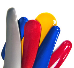 With all of Northern Engraving's parts it is hard to pick out a favorite. However, this series of trim parts is one of my favorite color development projects. They have been designed in a variety of special effect colors to coordinate with the end product. Colors include green, red and yellow. A smaller part has been printed in blue. At first site....pretty colors. It is not the shape of the part so much as the color that makes the parts interesting. The base metallic color is combined with a transparent tint of color. A high gloss top coat is layered on top giving them their deep, rich look. We have struggled a bit with developing these colors in the past, but in time we are getting better at it. With a rainbow of colors that can be used who knows what the future parts will look like. These parts look even better when you see them on a motorcycle and you can say, that looks pretty cool....we helped put that together.
|
|
Scott VonRuden Screen Press Operator |