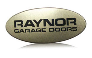
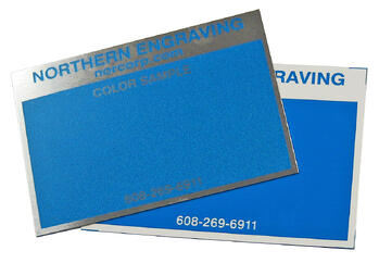
Metallic inks, like the one featured here on the Raynor nameplate, are an attractive option in creating cost effective product branding. Available in a variety of colors with the ability to be integrated into backgrounds or graphics, they offer visual texture. Whether placed in contrast to brushed or bright aluminum or complimenting opaque and transparent colors, metallic colors create a quality look.
Understanding the options and limitations in a process allows you to fully utilize it. This article is an excerpt from our Color Specifying for Product Identification ebook. It covers considerations when choosing colors to be matched in a metallic ink.
Translating Opaque Color to Metallic Color on Metal Logo Plates
Metallic colors, commonly used in the background of nameplates, rely on metal pigments (flakes, powders, or pastes) added to color formulations to create options ranging from fine to coarse metallic effects. The most popular choices are low gloss metallic silvers and grays used in contrast with high gloss graphics. Metallics create an etched appearance and can be effectively used in graphics. To ensure success, it is critical to understand the limitations in developing certain colors into metallics.
Basic Match
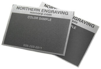
Grey successfully translates into numerous metallic effects. Typically another metallic color is referenced when specifying how coarse the metallic should be.
Black
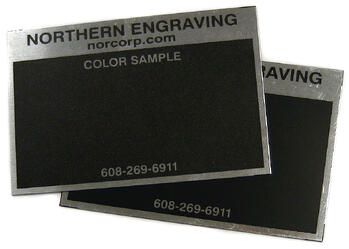
As discussed in the section on translating opaque color to transparent tints, black is an opaque color. Adding any metal pigment impacts black making it lighter. The more metallic added to black, the lighter and less black it becomes.
White
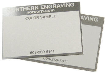
White is similar to black in that adding any metallic pigment to white impacts the color. Metallic pigments added to white darken the color. The more metallic pigment added to white, the greyer it becomes.
Saturated
Adding metallic pigments to saturated colors begins to grey the color and lighten it. The result is a less chromatic color.
For more information on color, click here to view our eBook.